Jake LedfordSenior Product Designer
Main content
Case study · Document annotation

Turning private marks into shared, searchable work

2partnerships: Samsung and Microsoft
9×faster to find a mark again, in testing
64%of new projects shared in their first month

01 · Overview

While I was working at Innovatemap, Folia came to us to build the new version of their annotation software. Their legacy app, iAnnotate, had more than a million users and a decade of features, and every mark it made stayed inside the file it was drawn on. The new version had to work on every screen and let a team mark up the same documents together.
Role
Product Designer, Innovatemap
Client
Folia, the company behind iAnnotate
When
2022 – 2024
Platforms
Designed for web, iPad, iPhone and Android. Shipped on Android, including Samsung's DeX desktop mode, and the web while I was there.
Team
I was the product designer on the account, working with Folia's product lead and its engineers
Outcome
Samsung and Microsoft partnerships
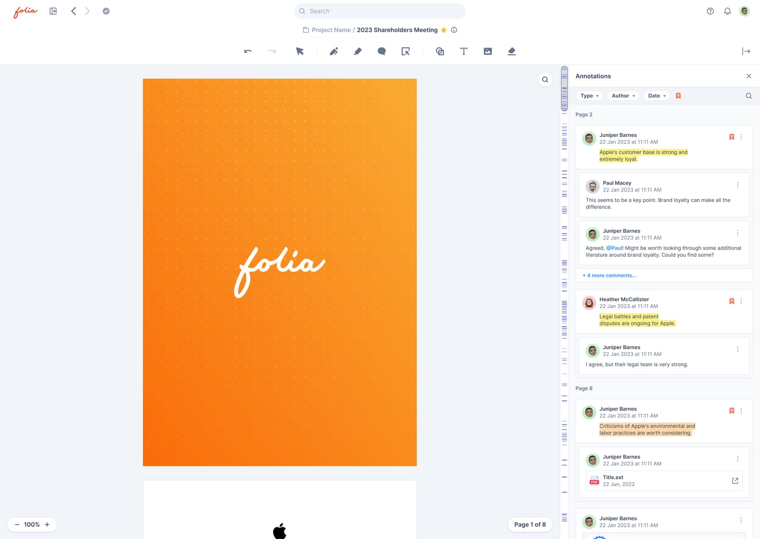
Folia's document view: an orange Folia cover page on the left, and an Annotations panel on the right listing highlights and threaded comments, filterable by type, author and date.
Folia's document view: the page on the left, and every mark on it as its own object on the right.

02 · The short version

Problem. Loyal users, a dated app. A million people marked up PDFs alone, one iPad each, with a toolbar that had grown to fit ten years of features.
What I did. Led the redesign across phone, tablet, desktop and web: the editor and its tools, search across every mark, sharing and threads, and the component library under them.
The result. Led a feature overhaul at Folia that landed Samsung and Microsoft partnerships.
ResearchInformation architectureAnnotation toolsSearchCollaborationDesign systemPen and tablet

03 · Context

iAnnotate had been how lawyers, bankers, professors and film crews marked up PDFs on an iPad since 2010.

The toolbar

A decade of features had piled onto the toolbar: 34 buttons on the first of four sets. Five of them did almost all of the work.

The marks

Search read one document at a time. A colleague's note on the same clause, in their copy, was out of its reach.

The sharing

Sharing meant exporting a flattened copy and emailing it. The discussion about the document happened in the email, away from the page.

04 · Research

Read the complaints, then watch the work

Before sketching anything, I put the old app's history in one place: its store reviews, a year of tool usage, the competition, and what device partners would ask for. Then I sat with people marking up their own documents.

503 written reviews. Every written review Apple's public feeds return for iAnnotate 4 in the US, UK, Canada and Australia, May 2016 to May 2022, coded by theme and by the reviewer's job.
16 interviews. Litigators, analysts, professors, students and a script supervisor, most of them iAnnotate users for five years or more.
6 sit-alongs. Watching people mark up their own work: a deposition, a diligence pack, a stack of essays, a shooting script.
12 months of tool events. Which of the toolbar's tools people actually reached for, and how often they switched.
14 apps, side by side. From Acrobat to GoodNotes, placed on two axes: solo or team, one file or many.
Partner checklists. What a device maker needs before it puts a pen app in front of its buyers: pen support, desktop modes, cloud files, admin control.

The reviews

503 written reviews of the old app, one dot each.

By stars

Sorted by stars, they pile up at both ends: 162 five-star and 160 one-star. Written reviews run angrier than ratings; the app averages 4.7 stars.

By theme

The 280 reviews of three stars or fewer were mostly about trust: lost work, broken sync, and a paid upgrade that took tools away.

The gap

Only one critical review asked to work with other people. To find what nobody thought to ask for, I had to watch people work.

05 · Findings

The work was already shared. The app wasn't.

The interviews and sit-alongs showed what the reviews couldn't: people already worked together every day, by exporting pages and arguing in email.

Finding 1Marks are found again by what they say. 7 of 9 attempts to find an old highlight started with a word, not a page number. Design response Search reads the words in every mark.
Finding 2The conversation lived in email. 14 of 16 interviewees shared marked-up pages by exporting or screenshotting them. Design response Any mark can carry a thread.
Finding 3Trust came before features. Lost work topped the reviews, and 11 of 16 interviewees first asked if their files would come too. Design response Folia ran alongside iAnnotate, and always shows whether your work is saved.
Finding 4Work comes in sets. In the sit-alongs, the median task touched six documents, and people rebuilt each folder by hand. Design response The project became the unit of work, holding its documents, people and roles.

“The PDF is the record. The argument about it is in my inbox.”

Equity research analyst, in an interview
06 · The reframe

In iAnnotate, a highlight lived inside one PDF, on one iPad.

In Folia, every mark lives on its own layer, above the page.

Each one becomes an object, with an author, a page, a type and a thread.

Objects can be searched, filtered, shared and argued about. A mark sealed in a file can't.

07 · Tools

Eight tools, and presets for the rest

I cut the toolbar to what people reached for and grouped it by job: pen, highlighter, comment and area select for marking, then shapes, text and images for adding, with the eraser at the end. Colour, width and opacity moved into presets one tap away, so a power user's setup survived without a wall of buttons.
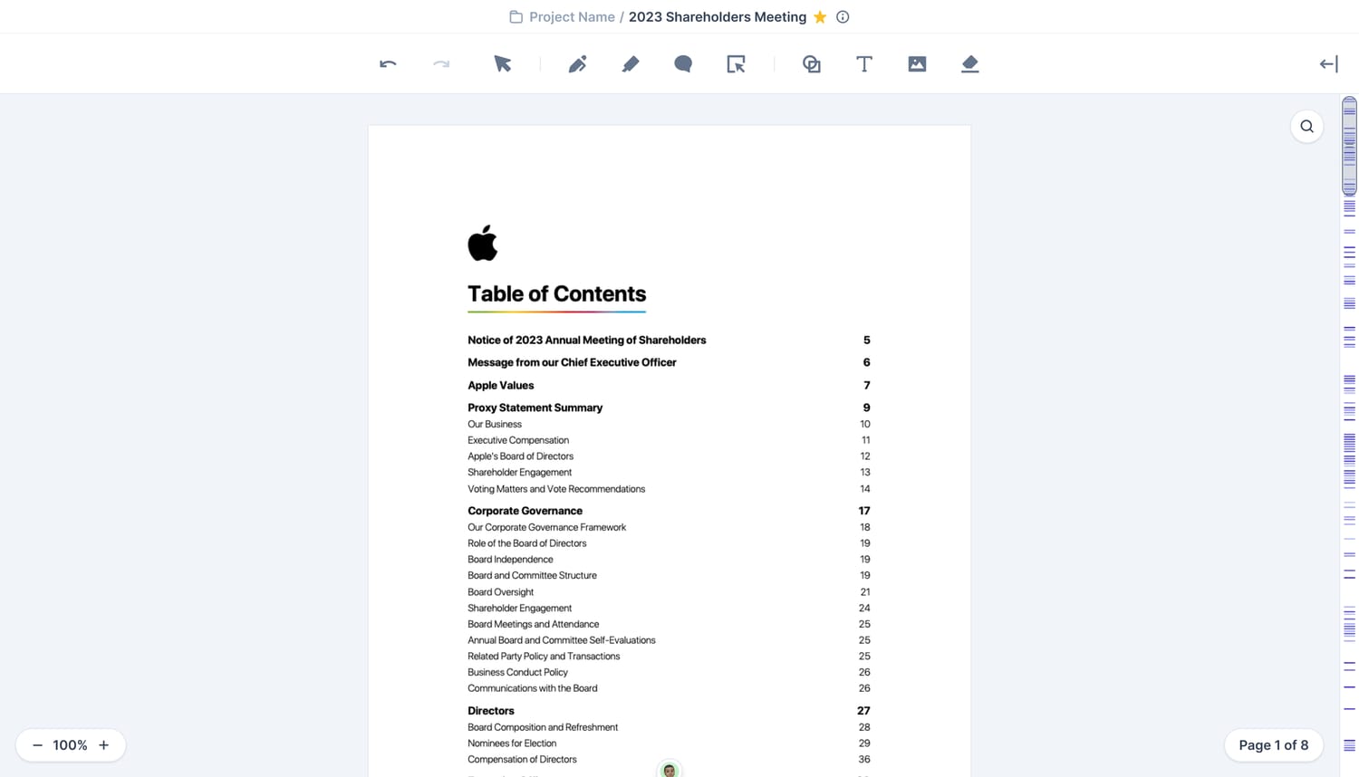
Folia's editor: the toolbar grouped by job across the top, and a scrollbar of annotation ticks along the right edge.
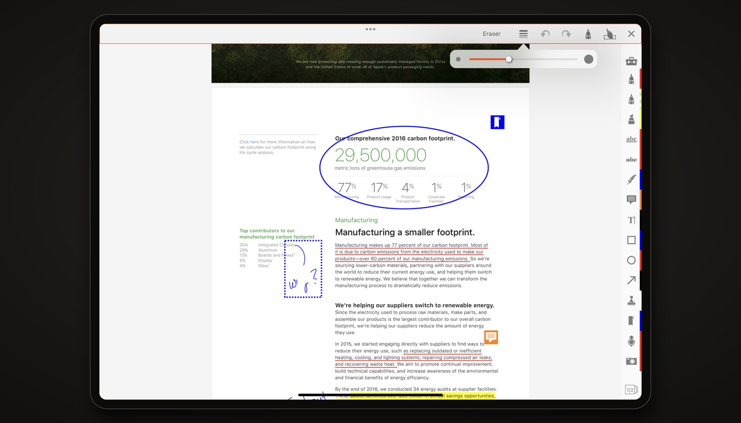
iAnnotate on an iPad: an annotated report with an ink ellipse, underlines, a highlight and a note, and a column of tool tabs down the right edge.
Drag the handle. iAnnotate's editor on an iPad, and Folia's: the column of tool tabs gave way to one toolbar grouped by job, and a scrollbar that shows where the marks are.
Try it. Pick the pen or the highlighter, choose a preset, and mark up the page.
The long tail. Share of all marks by tool over a year. The five busiest got the best places, with underline now under the highlighter. Of the other 29, the shapes folded into one tool, photos into Image and the lasso into area select; the rest moved into menus.
Presets one tap away. Three saved mixes of colour, width and opacity for each tool.
A scrollbar that shows the marks. Every mark leaves a tick on the scrollbar, so a long document shows where the discussion is.
Pen draws, finger scrolls. Designed so the pen marks and the finger moves the page, and the two never fight over one gesture.
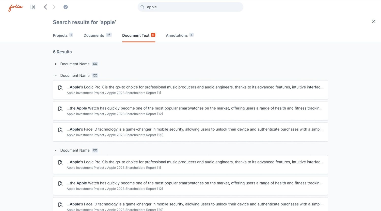
Search results for 'apple', on the Document Text tab: each match is a card with the snippet, the project and document it comes from, and the page number.
One card for every match. A second pass at search gave every text match the same card: the snippet, its project and document, and the page it's on. The first pass had no page on a text hit.
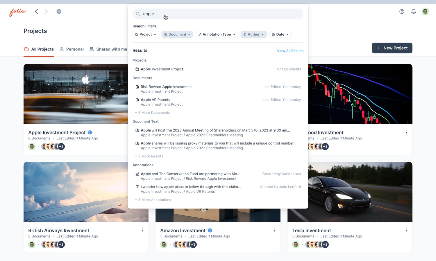
Quick results dropping down from the search box on the Projects page, grouped into projects, documents, document text and annotations, with filter chips above.
Results while you type. Quick results arrive grouped the same way, with filters for type, author and date, before you open the full results page.
09 · Collaboration

The conversation moves onto the page

A project has one member list and three roles: viewers read, contributors add their own marks, editors run the project. Any mark can start a thread, and people are pulled in with a mention instead of an email.

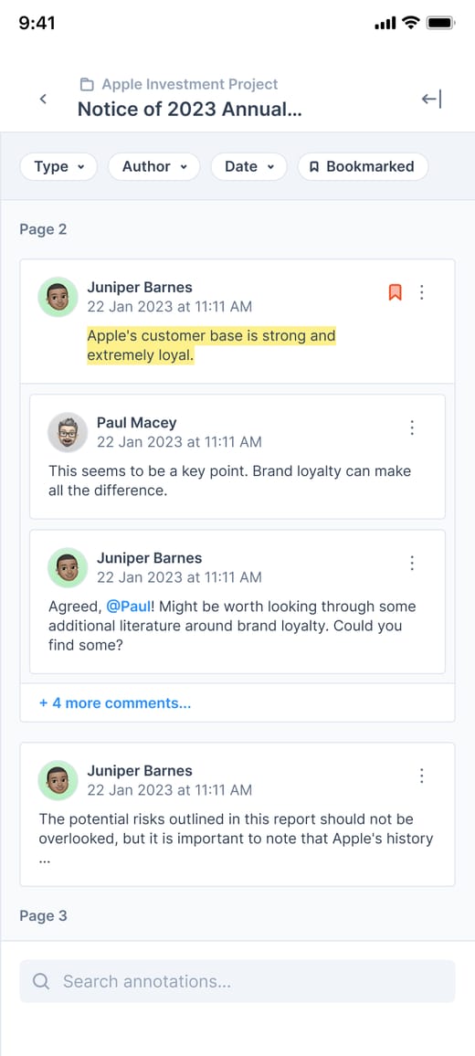
Threads on the mark. Replies and mentions live on the highlight they're about.
Three roles, one list. Viewer, contributor or editor is set from the member list, and an invitation opens before the account does.
One feed for activity. Invitations, replies and new documents arrive together, per project.
Offline, and honest about it. The bar shows online, offline, syncing or failed, and a new upload waits on the device until the connection comes back.

10 · Every screen

Folia had to feel native under an S Pen on a phone or a foldable, on a monitor through DeX, and in a browser at a desk.

Live

A mark made on one screen appears on the others in real time.

Enterprise

Folia opens files from OneDrive. The Microsoft partnership ran through Intune, where iAnnotate already had an enterprise app.

The launch

Six items on the checklist, ticked, and two partners signed. Samsung put Folia beside the Galaxy S24 in January 2024.
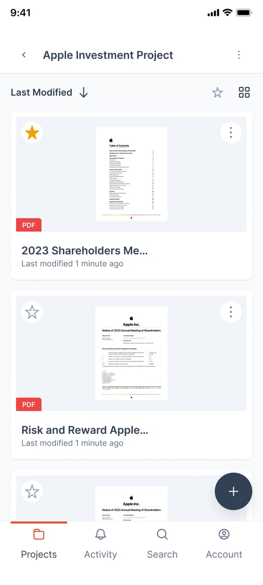
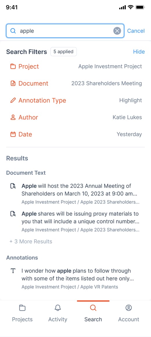
On a phone · five screens from the mobile flows, drawn for iOS. Android shipped first.
A project on a phone: its documents as cards, last modified first, with a bottom navigation bar.
A project
Search on a phone, with five filters applied and results grouped as document text and annotations.
Search
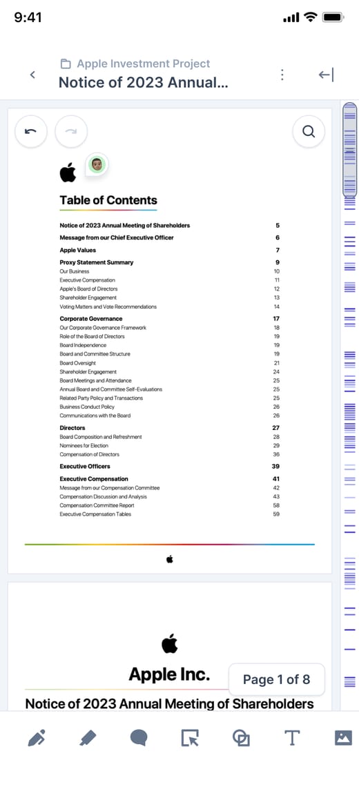
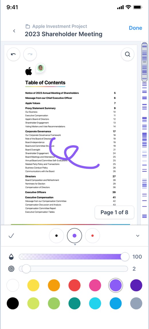
A document on a phone, with the annotation scrollbar along the right edge and the tool bar at the bottom.
Reading
The Annotations panel on a phone: filters, a highlight and its threaded replies.
Annotations
The pen tool on a phone: a stroke on the page, with opacity and width sliders and a colour palette.
Pen
11 · Design system

One library under every screen

I built one component library and designed almost every flow three times, for desktop, tablet and phone. The three layouts are window widths, so a phone driving a monitor through DeX gets the desktop layout. Components carry a density for pointer, touch and pen: compact under a mouse, generous under a thumb, with hover previews under a pen.

Switch the input. One component, three target sizes: the thumb gets room, the pen gets a hover preview.
Tokens first. Colour, type and spacing named once and matched to the names engineers used, so a design decision and its code were the same word.
33
component pages in the library From accordions to tooltips, each with its states and variants.
4,413
component instances in the final design file Built from 150 components, so a change to one reaches every flow.
3
layouts for almost every flow Desktop, tablet and phone, specified side by side.
12 · Decisions

Five calls, with notes in the margin

I wrote up each call in a Folia document and asked the team that would pay for it to argue back. Their comments are in the margin.

Design decisions · Folia beta5 decisions · 5 open comments

01 Projects replace folders

Work arrives in sets: a matter, a deal, a course. A project holds the documents, the people and their roles, so sharing a project replaces sending a copy.

02 Eight tools, plus presets

Five tools made 91% of all marks. The rest moved into menus, and presets keep each person's colours, widths and opacity one tap away.

03 Run alongside iAnnotate

In 2016 a paid upgrade that dropped features took iAnnotate's written reviews to two stars in two months. So Folia shipped as its own app, next to iAnnotate, and people moved a project over when they next needed to share it.

04 Layouts follow the window

A Galaxy tablet in split screen, a foldable half open, a phone driving a monitor through DeX: one device can be any size. Every component carries a pointer, touch and pen size, chosen by the window and the input in hand.

05 Android and the web first

The Samsung launch set the date, so Folia shipped on Galaxy phones, tablets, foldables, DeX and the web first. iAnnotate's own users, most of them on iPads, waited for a native app.

13 · Outcomes

A week-old highlight, found in 11 seconds

The sit-along task, rerun as a benchmark: find a highlight made a week earlier. One dot per attempt; 12 participants, the same documents, iAnnotate against the Folia beta.
9×
faster to find a mark again The median person found it 9 times faster. Median times: 94 seconds in iAnnotate, 11 in the Folia beta.
81
usability score for the beta System Usability Scale, against 58 for iAnnotate with the same 12 people.
64%
of new projects shared in their first month With at least one other person, in the first quarter after launch.
Partners. Samsung featured Folia with the Galaxy S24 in January 2024 and again on its business blog for the Z Fold6 that August. Microsoft lists it as an official Intune partner.

“It's the first time the argument and the document have been in the same place.”

Litigation partner, beta customer
In their words. From a customer call, eight weeks into the beta.
14 · Reflection

What I would do differently

  1. Mining the reviews first was right, but reviews only describe what is broken, never what is missing. Next time the first sit-along happens in week one, not week three.
  2. Designing for the S Pen and the browser at the same time caught problems early. The partner checklist told us what to build. It did not tell us how a device team would judge the result, and we met them late. Next time they sit in critiques from the first beta.
  3. Presets saved the toolbar decision. I would ship them in the first beta instead of the third, before power users decided we had taken their tools away.
Next case study · Allied Solutions

Redesigning visibility for lender asset recovery →