
MSPbots
Getting new users to their
first useful dashboard
CONTEXT
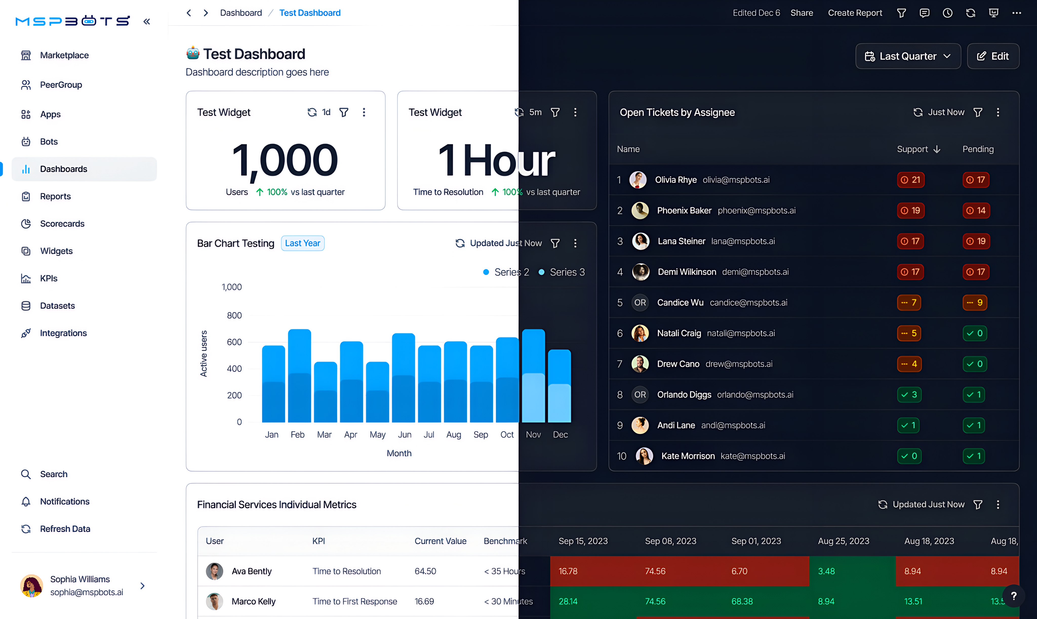
MSPbots sells business intelligence to managed service providers. A typical MSP runs on tools that do not talk to each other. Ticket data sits in ConnectWise or Autotask, billing sits in QuickBooks, device health sits in an RMM. MSPbots pulls all of it into one place and turns it into widgets and dashboards. Owners buy it because they want technician utilization, time to resolution, SLA performance, and client profitability in one view instead of five exports.
MSPbots came to Innovatemap with a churn problem. New accounts signed up, opened the product, and never reached a dashboard that told them anything. The widget library held thousands of options with no way to narrow them down to the handful that applied to a given shop. Building a custom widget dropped the user straight into a configuration panel full of measures, properties, and axis controls. Users who knew exactly what they wanted to see could not get the product to show it to them.
APPROACH & OUTCOMES
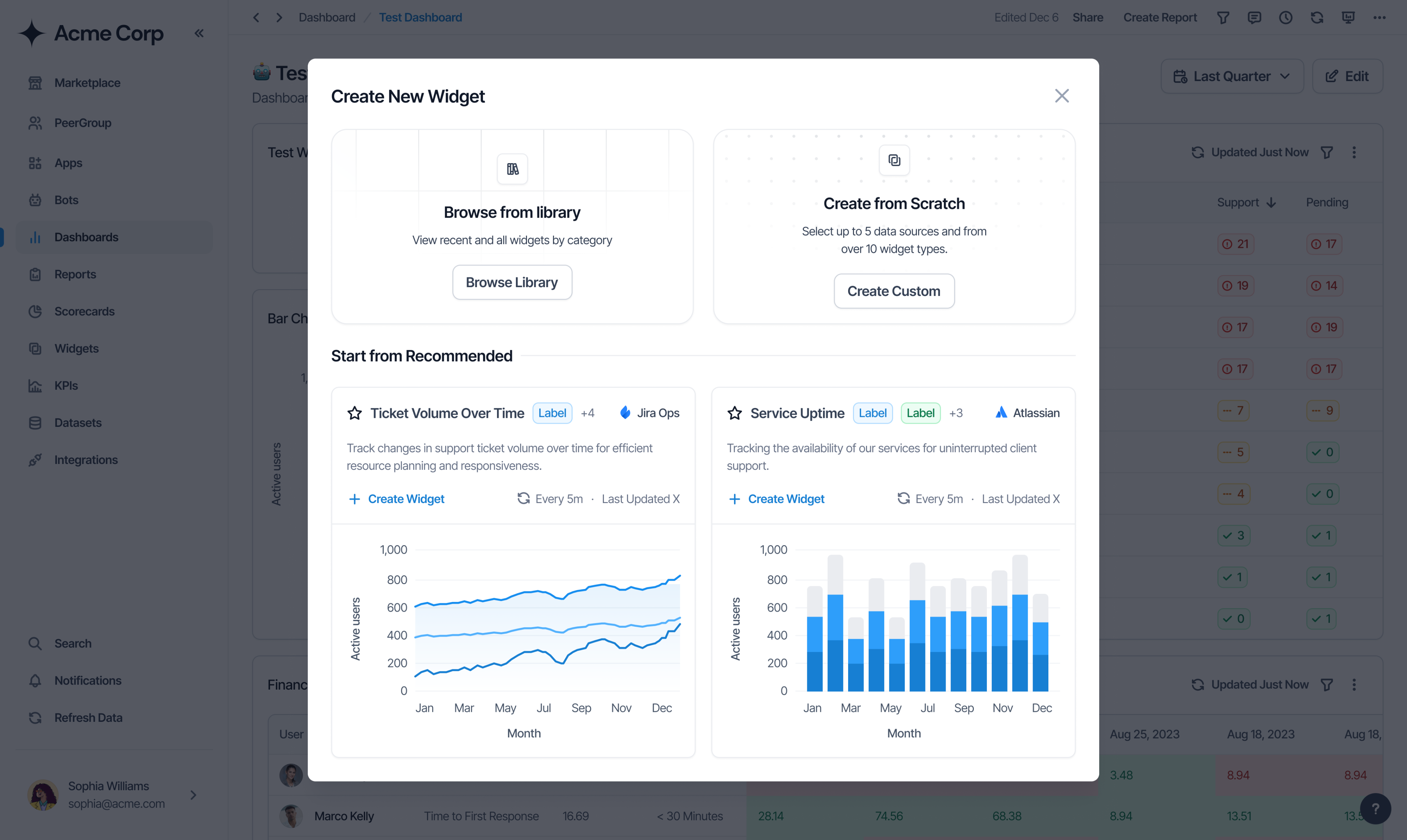
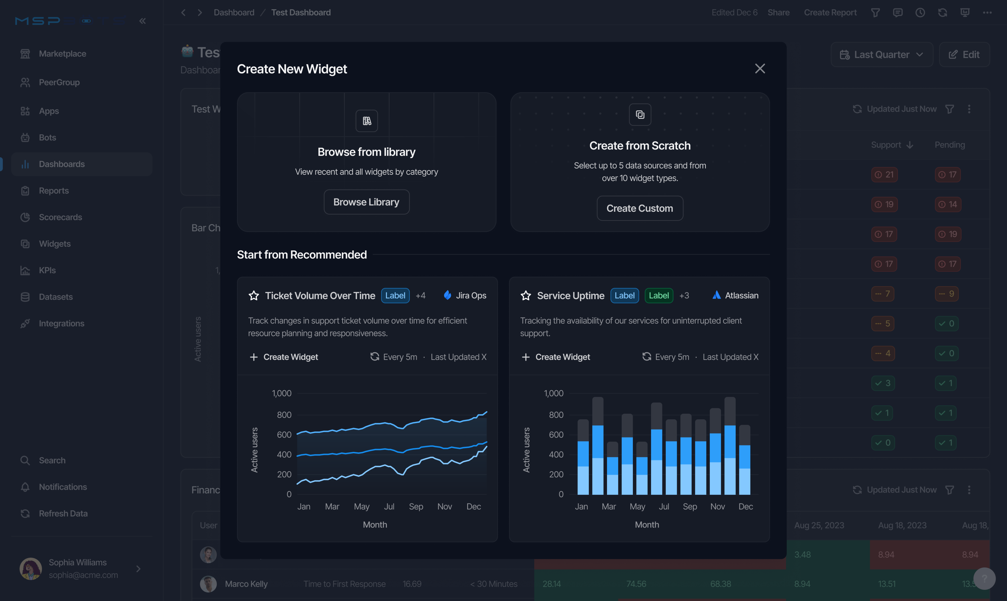
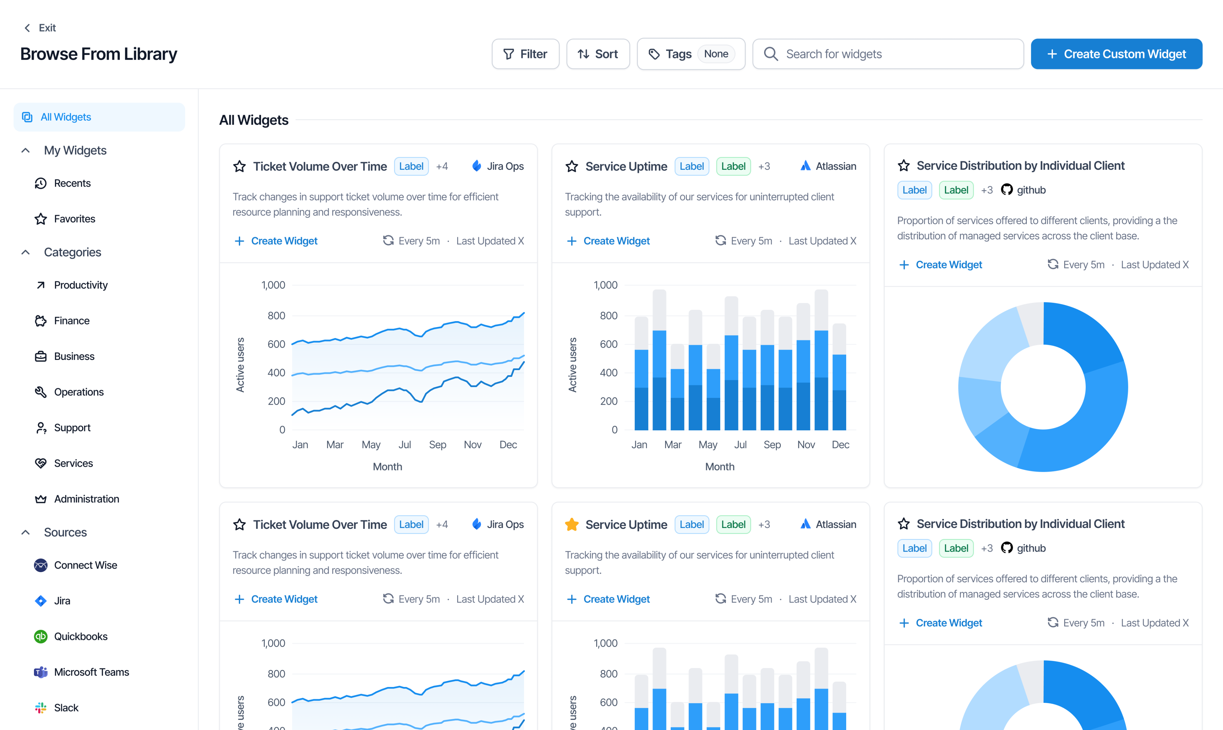
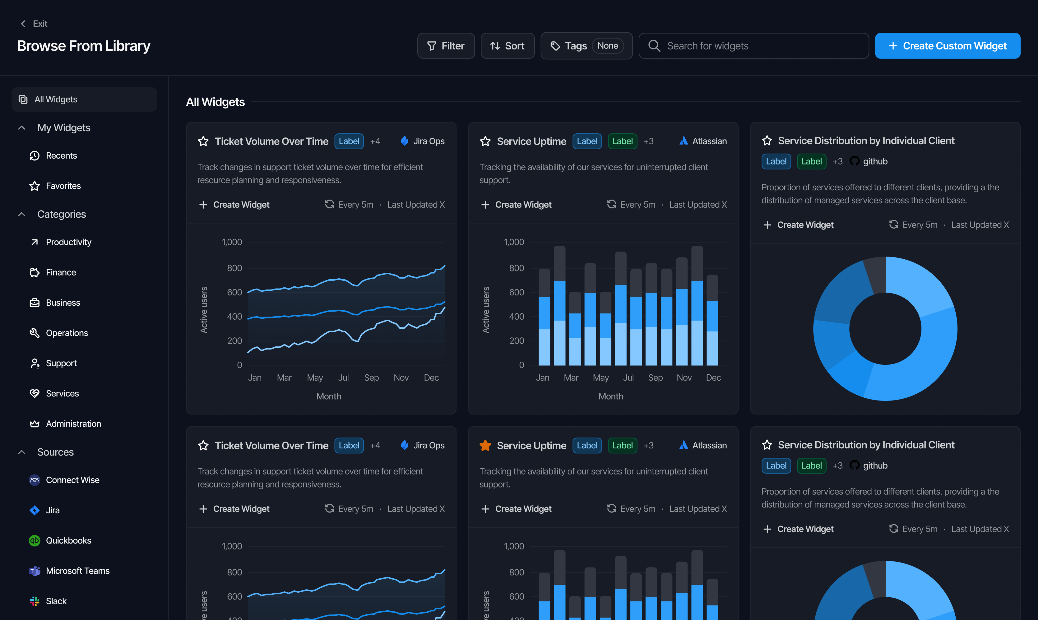
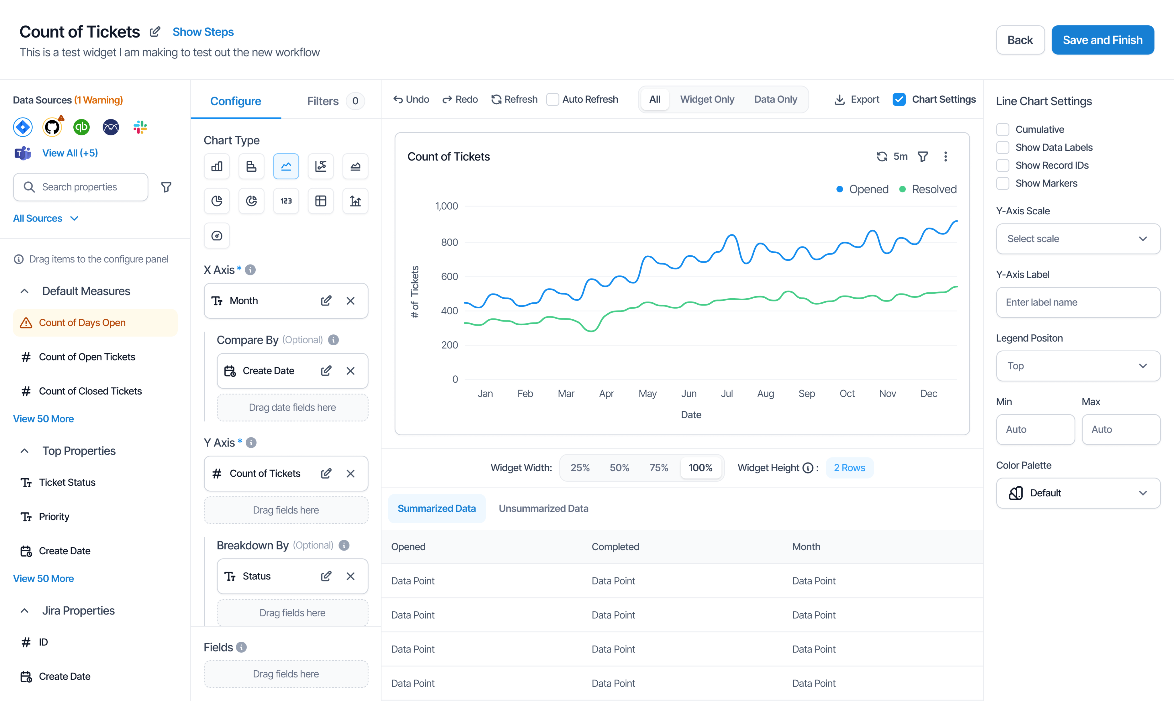
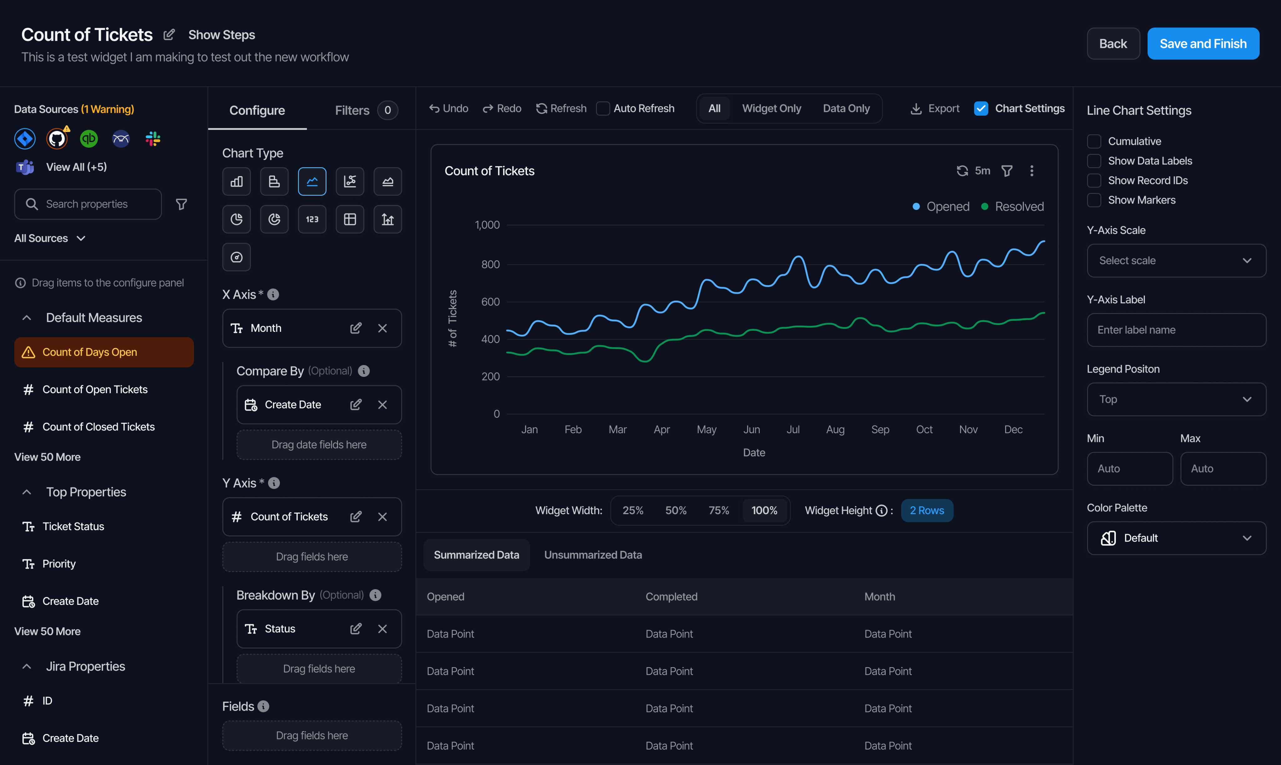
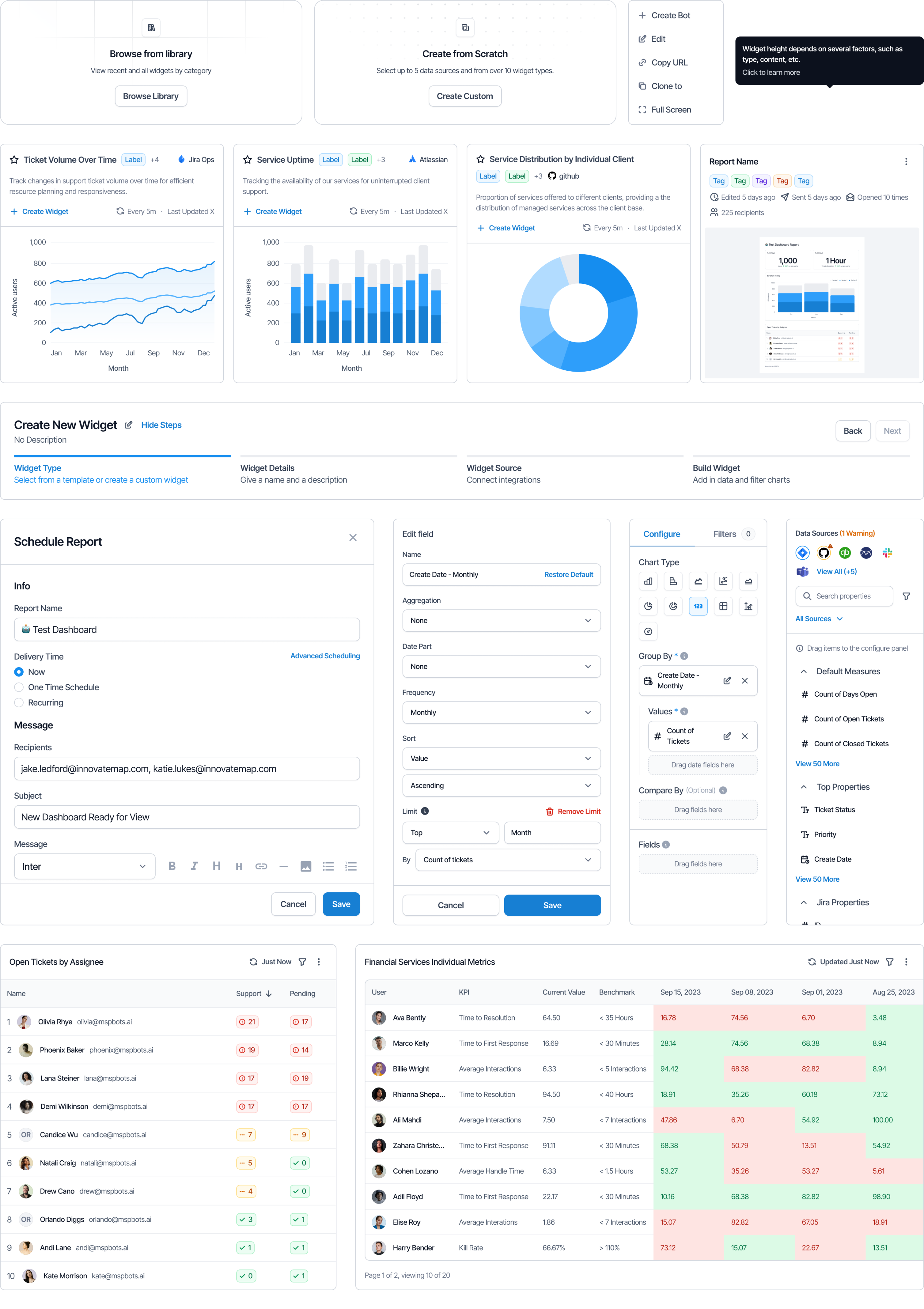
I ran interviews with MSP owners, service managers, and dispatchers, then watched them build widgets in the existing product. Everyone arrived with a plain question in mind, something like which technician is slipping on SLA this week, or which client is eating hours we do not bill for. The builder asked them to answer a different set of questions first. Pick a chart type. Pick a data source. Pick a measure. The vocabulary belonged to the data team, not the person paying for the tool. That gap was where new accounts stalled out.I rebuilt widget creation around three ways in. Users can browse the full library, filtered by category and by the integrations their account already connects to. They can start from a recommended widget that MSPbots suggests based on those same connections, which gives a new account something working in a few clicks. Or they can build from scratch. For the scratch path I broke the process into named steps for widget type, details, source, and build, which keeps the configuration panel from being the first screen a new user meets. I redesigned that panel to pull measures and properties directly from the connected source and to render a live chart preview as fields get dragged in, so users see the effect of every change instead of guessing and saving.
I also designed the scheduling and sharing flow. MSPs report to their own clients, and the recurring report a manager sends every Monday is the thing that makes a dashboard worth building. Dashboards became something a team could distribute rather than a screen one person checked.
Churn fell by roughly half after launch and annual recurring revenue crossed seven figures.
Go back home
MSPbots
Getting new users to their
first useful dashboard
CONTEXT
MSPbots sells business intelligence to managed service providers. A typical MSP runs on tools that do not talk to each other. Ticket data sits in ConnectWise or Autotask, billing sits in QuickBooks, device health sits in an RMM. MSPbots pulls all of it into one place and turns it into widgets and dashboards. Owners buy it because they want technician utilization, time to resolution, SLA performance, and client profitability in one view instead of five exports.
MSPbots came to Innovatemap with a churn problem. New accounts signed up, opened the product, and never reached a dashboard that told them anything. The widget library held thousands of options with no way to narrow them down to the handful that applied to a given shop. Building a custom widget dropped the user straight into a configuration panel full of measures, properties, and axis controls. Users who knew exactly what they wanted to see could not get the product to show it to them.
APPROACH & OUTCOMES
I ran interviews with MSP owners, service managers, and dispatchers, then watched them build widgets in the existing product. Everyone arrived with a plain question in mind, something like which technician is slipping on SLA this week, or which client is eating hours we do not bill for. The builder asked them to answer a different set of questions first. Pick a chart type. Pick a data source. Pick a measure. The vocabulary belonged to the data team, not the person paying for the tool. That gap was where new accounts stalled out.I rebuilt widget creation around three ways in. Users can browse the full library, filtered by category and by the integrations their account already connects to. They can start from a recommended widget that MSPbots suggests based on those same connections, which gives a new account something working in a few clicks. Or they can build from scratch. For the scratch path I broke the process into named steps for widget type, details, source, and build, which keeps the configuration panel from being the first screen a new user meets. I redesigned that panel to pull measures and properties directly from the connected source and to render a live chart preview as fields get dragged in, so users see the effect of every change instead of guessing and saving.
I also designed the scheduling and sharing flow. MSPs report to their own clients, and the recurring report a manager sends every Monday is the thing that makes a dashboard worth building. Dashboards became something a team could distribute rather than a screen one person checked.
Churn fell by roughly half after launch and annual recurring revenue crossed seven figures.
Go back home
MSPbots
Getting new users to their first useful dashboard
CONTEXT
MSPbots sells business intelligence to managed service providers. A typical MSP runs on tools that do not talk to each other. Ticket data sits in ConnectWise or Autotask, billing sits in QuickBooks, device health sits in an RMM. MSPbots pulls all of it into one place and turns it into widgets and dashboards. Owners buy it because they want technician utilization, time to resolution, SLA performance, and client profitability in one view instead of five exports.
MSPbots came to Innovatemap with a churn problem. New accounts signed up, opened the product, and never reached a dashboard that told them anything. The widget library held thousands of options with no way to narrow them down to the handful that applied to a given shop. Building a custom widget dropped the user straight into a configuration panel full of measures, properties, and axis controls. Users who knew exactly what they wanted to see could not get the product to show it to them.
APPROACH & OUTCOMES
I ran interviews with MSP owners, service managers, and dispatchers, then watched them build widgets in the existing product. Everyone arrived with a plain question in mind, something like which technician is slipping on SLA this week, or which client is eating hours we do not bill for. The builder asked them to answer a different set of questions first. Pick a chart type. Pick a data source. Pick a measure. The vocabulary belonged to the data team, not the person paying for the tool. That gap was where new accounts stalled out.I rebuilt widget creation around three ways in. Users can browse the full library, filtered by category and by the integrations their account already connects to. They can start from a recommended widget that MSPbots suggests based on those same connections, which gives a new account something working in a few clicks. Or they can build from scratch. For the scratch path I broke the process into named steps for widget type, details, source, and build, which keeps the configuration panel from being the first screen a new user meets. I redesigned that panel to pull measures and properties directly from the connected source and to render a live chart preview as fields get dragged in, so users see the effect of every change instead of guessing and saving.
I also designed the scheduling and sharing flow. MSPs report to their own clients, and the recurring report a manager sends every Monday is the thing that makes a dashboard worth building. Dashboards became something a team could distribute rather than a screen one person checked.
Churn fell by roughly half after launch and annual recurring revenue crossed seven figures.
Go back home